History by Design: The Importance of Good Design in Public History

The earliest museums did not look much like the ones we know today. They were repositories of stuff, Cabinets of Curiosity curated by enthusiastic collectors. When artist, naturalist, and scientist Charles Willson Peale what is widely recognized as America’s first museum in Philadelphia in 1786, he first filled it with his own paintings of George Washington and the bones of woolly mammoth. It was random, there was no narrative. Artifacts were preserved, but not interpreted.

C_W_Peale_-_The_Artist_in_His_Museum (1).jpg

In this self portrait, Charles Willson Peale pulls back a curtain on his museum, where artifacts are arrayed on shelves. (Pennsylvania Academy of the Fine Arts)

A lot has changed in the intervening decades (and centuries), and today museum exhibits do a lot more than display artifacts – they immerse visitors in narrative, pair artifacts with images, video, and audio, and feature innovative interactive experiences. The confluence of content and atmosphere mean that, more than ever, the best exhibits are developed not only by historians and curators, but by architects, designers, and programmers. Every aspect of exhibit design – from colors and fonts to lighting and layout – dictates how a visitor will experience and relate to the content, and it is critical that the design and content sync up.

This past fall I had the privilege of taking an Exhibition Design class through George Washington University’s Museum Studies program, which strengthened my conviction that public historians should become acclimated with the fundamentals of design so, at the very least, they can communicate with designers. And, as may be the case at smaller museums and historic sites, they will be prepared to take on the role of designer themselves.

First Ladies-01

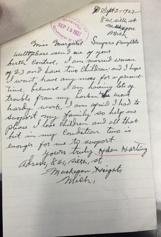
Before and after photos of the First Ladies exhibit at the Smithsonian demonstrate how design can transform an exhibit. (Smithsonian Archives)


There is a lot to learn about design, from its principles to computer programs like AutoCAD, Photoshop, and InDesign that designers rely on heavily. To some extent, too, good design cannot be taught or even necessarily learned – as my graphic designer sister assures me, some people have a natural eye for it, others don’t, and that’s okay. It is not, by any means, something that public historians need, or, let’s be honest, even have the time, to become experts in, but again, I believe having a grasp on the basics is fundamentally important, and not too difficult. Here’s an brief overview.

Organizing Space
Designers are responsible for transforming a given space into an exhibit. This involves a lot more than put panels on walls and objects in cases. It means determining how visitors will move through the exhibit. Will they be guided through from beginning to end? How do you accomplish that? How do you signal to visitors how to move? One prominent example of such an exhibit is the main gallery at the United States Holocaust Museum and Memorial here in Washington, D.C. Other exhibits have an open flow, visitors can move freely from one area to the next. How an exhibit is laid out will have a major bearing on the organization and order of the content.

Color and Texture
The colors, textures, graphics, and materials used to fabricate an exhibit go a long way in setting the environmental mood and thus a visitor’s experience. Cool colors often create a more modern atmosphere, while warm colors tend to feel more historical or earthy. Texture adds a different layer of sensation, and can further immerse a visitor in the experience. The Hall of Geology, Gems, and Minerals at the Smithsonian Natural History Museum makes good use of texture, including walls made of rough rock that give the visitor the feeling of entering a mine.

Exhibit Labels
Exhibit labels are important not only because they convey content but because, if done poorly, a visitor will not take the time to read them. Historians need to work with designers to make sure their labels are the right length, while designers select the typeface, size, and placement of the text. The text must be readable at appropriate distances, and also for visitors with vision impairments, so it cannot be too small (or too big), or employ a font that it is difficult to read. The color of the font must be appropriate for the background of the panel, so there is enough contrast and visibility. The designer must also establish hierarchy, so visitors can distinguish titles from labels and captions. It should ensure that, even if a visitor only skims parts of panels, they easily be able to identify what is most important to read. Hierarchy can be seen in the photograph of the poster I designed below – the title is prominent, as is the lead that is meant to hook the reader. The main text is larger than the sub-topic text, which is larger than the image captions.

Lighting
The way an exhibit is illuminated can also has significant bearing on visitor experiences. Dark spaces convey a serious mood, giving content a certain gravitas, while open, light spaces do just the opposite. Records of Rights at the National Archives is a good example of an exhibit with appropriately low lighting. Of course, mood is not the only reason for lighting decisions. Lighting designers must also work with conservators to ensure that objects are not exposed to damaging amounts of light, another reason for the low lights on delicate documents at the National Archives.

This is just a small glimpse at the important work that designers do in bringing history to the public, but hopefully a helpful one. For more information I would recommend Kathleen McLean’s excellent Planning for People in Museum Exhibitions.

12341052_10100114332413914_1338457225476948152_n

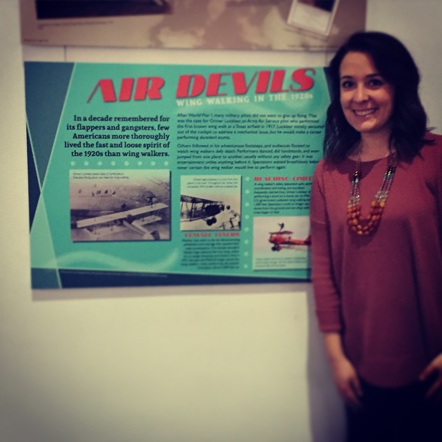
The poster I designed for my Exhibition Design class is currently on display on at the Smithsonian National Air and Space Museum.

Beyond Flappers: Challenging Gender Norms in the 1920s

The flapper, with her bobbed hair and swinging, beaded fringe, has become an iconic character of the American past. She was young, educated, and daring. She smoked, she drank, she danced, she showed off a lot more than just her ankles. And in the process, she challenged the lives and expectations of past generations. The flapper wanted a career. She wanted to date before marriage. She did not want to settle down and raise children – at least not until she had experience more of what life had to offer.

Yet the flapper lifestyle was by no means a universal experience for women in the 1920s. Indeed, it was very much an urban, middle- to upper-class phenomenon, one that, for many women, remained distant, even alien. A 1922 article in the Prescott, Arizona, newspaper The Weekly Journal-Miner attests to that: “Typical Flappers. You’ve often heard ’em called that, but did you ever really understand what it meant?” It identifies them for the reader, as if providing a classification for an exotic bird that might one day be spotted in the wild.

1922 08 02 Weekly Journal Miner

But the story of resistance to gender norms does not end with flappers. Over the summer, I was struggling to come up with a definite topic for my research seminar when at the National Archives I stumbled across a collection of letters written by women across the United States to the Children’s Bureau  – a federal agency charged with improving the lives of women and their children. A majority of these women came from rural areas, towns like Creston, Montana, or Villisca, Iowa, with small populations. They were the wives of farmers and laborers. Women like Gertrude Lirones of Mount Pleasant, Michigan, whose husband worked as a hat cleaner. Their lives could not have been further removed from their daring, glittery flapper counterparts. And yet each of the 46 women whose letters I found at the archive sought change her life, to achieve more than, in the words of one letter writer, “Poverty & More Babies.”

The writers of these particular letters all wrote to the Children’s Bureau asking for birth control. While at this time activists like Margaret Sanger were making strong arguments for birth control, the agency did not take a stance on or give advice about it. Indeed, it would have been illegal for them to do so – an 1873 law outlawed the sale, publication, or dissemination, especially through the mail, of any device or material related to the prevention of conception. Women wrote all the same, some desperate, others determined and defiant, and all hoping to gain some control over their health and their lives.

Flappers were not alone in their quest to change the female experience, and these remarkable letters provide ample proof. Below I’ve included a few of the letters, and a snapshot of the women who wrote them, information I was able to glean using census records from Ancestry.com.

Sophia Micka, of Cayuga, North Dakota, wrote to the Bureau in 1921. She and her husband, a meat merchant, had seven children, but she “did not want any more after [she] had two.” Her letter alludes to now controversial debates about who should or should not have children.

NARA102_Bx186(2-9.1)

Helen Harting of Muskegon Heights, Michigan, wrote her letter in 1927. At 23 she already had two children – Pearl and Leonard – and a husband who did not support her. Like all of the women in this study, the Children’s Bureau did not provide assistance, but records reveal that she was able to divorce her husband in 1929, citing “extreme cruelty & non-support.”

NARA102_Bx269(2-18)

Finally, Gertrude Lirones of Mount Pleasant, Michigan, wrote for help in 1929. She was raising five children under the age of 10 and worried that any more would cause too much financial and physical stress. “Sicknesses every year. Bills! Wife very tired… Having to keep on child bearing strikes absolute terror to wife’s heart. She goes on to mention all of the advice pamphlets available – on everything from goats to bird houses – and writes that “If the government can’t help us now we’ll feel pretty badly.” She did not get the help she sought – by 1940 Gertrude had given birth to three more sons.

NARA102_Bx377(2-31.2)

These letters show only a glimpse at these women’s lives, but what they reveal is both heartbreaking and powerful, and indicative of powerful, growing trends. None of these women received assistance from the Children’s Bureau, but what’s important is that they sought it in the first place.


Welcome!

So, what exactly do you do?

One of the ironies of being a public historian is that, for the most part, people have no idea what that means. The phrase “public history” has so much meaning – often contested – within the field, and almost no meaning outside of it. It’s a phrase that tends to elicit a response like, isn’t all history public? Or, as opposed to what, private history?

This blog seeks to take one small step towards exposing what we do and why we love it. It also allows us, as students in a graduate program, to share our studies, research, and work experiences. We are constantly grappling with new perspectives, developing arguments, and uncovering fascinating resources, and a lot of what we do does not reach the public. It is grueling and frustrating and utterly rewarding, and this is our way of sharing it with you.

We won’t use this post for definitions – we hope that the blog will provide a better sense of this rich, diverse field than we could possibly do in a few sentences. Happy reading!